Microsoft's Groove music may be getting a new, better logo

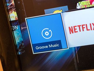
Ever since Groove launched a few weeks ago, some users were not too fond of the new logo. Now, a new Store update may reveal what is coming next: a redesigned emblem for Microsoft's new (old) music service.
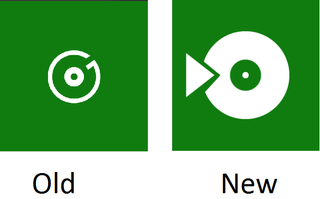
Users on Windows Central started noticing the new design within the last day or so, and we have been able to confirm. The new design, which does look much better, is a simple record with a universal play logo on it. It certainly evokes a music app much more clearly than the previous record + G design.

The current Groove app still uses the old (new) logo as well as the apps on Android and iOS, which were recently rebranded. It is like that this new logo will appear with the next app update, so we'll have to wait and see.

For now, you can see what possibly awaits. Let us know if you like the new-new logo or prefer the old design. We clearly on team new-new logo!
Everything you need to know about Groove Music
Thanks, everyone, for the tips!
Get the Windows Central Newsletter
All the latest news, reviews, and guides for Windows and Xbox diehards.

Daniel Rubino is the Editor-in-chief of Windows Central. He is also the head reviewer, podcast co-host, and analyst. He has been covering Microsoft since 2007, when this site was called WMExperts (and later Windows Phone Central). His interests include Windows, laptops, next-gen computing, and watches. He has been reviewing laptops since 2015 and is particularly fond of 2-in-1 convertibles, ARM processors, new form factors, and thin-and-light PCs. Before all this tech stuff, he worked on a Ph.D. in linguistics, watched people sleep (for medical purposes!), and ran the projectors at movie theaters because it was fun.