How to enable four columns for the Start screen on the Lumia 950

Windows 10 Mobile, like its predecessor, sits somewhere between iOS and Android regarding customization. You cannot just hack and move around everything, but you do have a lot more choice than an iPhone.
One feature that arrived with Windows 10 Mobile is the ability to have more columns on the Start screen. On phones with smaller displays, users can have one wide tile and one medium tile adjacent (or just three medium tiles). On a phone like the Lumia 1520, however, you can have two wide tiles side by side (or four medium tiles).
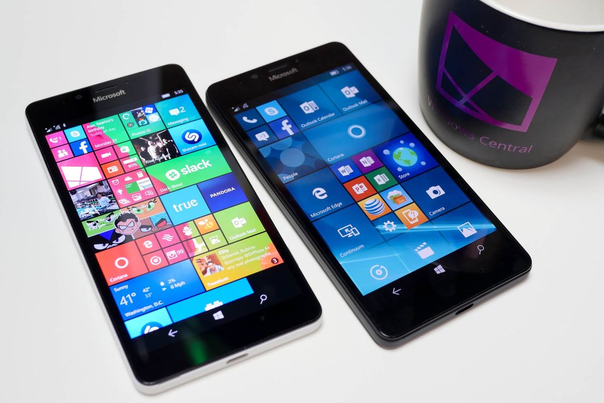
By default, the Lumia 950 opts for the three-column layout. Personally, I think it is a good choice as it keeps the Live Tiles at just the right size for most users. In Windows 10 Mobile users can also toggle a switch to 'Show more tiles' that adds in a fourth row. Interestingly, this does nothing on the Lumia 950 by default. The reason has to do with text size and is easy to work around.
Without further ado, here is how to enable four column support on the Lumia 950.
Enable more Live Tiles for the Lumia 950
1. Settings
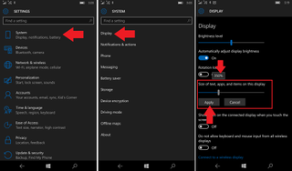
Go to Settings > System > Display
2. Adjust size
Navigate down until you see Size of text, apps, and items on this display. By default, the Lumia 950 is set at 400%. This setting is due to the extremely high-resolution format (1440x2560) that is crammed into a small 5.2-inch screen. You will want to move the slider to the left until it says 350% instead. Once set, you need to tap Apply and restart the phone.

3. Show more
Now that the phone has rebooted, we are still not where we want to be so there is one more setting. Navigate to Settings > Personalization > Start and enable Show more tiles.
Get the Windows Central Newsletter
All the latest news, reviews, and guides for Windows and Xbox diehards.

That's it!
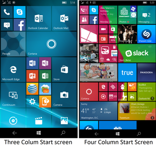
Heading back to the Start screen and you should now have a fourth column. It is clear that at 400% there is just not enough room for the extra column, but by reducing text size and other UI elements we can make space. You will need to move your Tiles around to make use of the extra area, and unfortunately, toggling Show more tiles on and off does not preserve your setup.

So, is it better? The choice is up to you. Certainly with the fourth column there is much more information crammed on the Start screen, and you can have many more Tiles readily available. Some users, however, will likely find the text too small or the overall look just "too busy". Luckily, you can play with these settings and find what works for you.
For now, I have opted to keep the extra column as I like the sharpness, and you may want to consider it as well. If not, at least you now know how to change it!
Where to buy
Want to know which Type-C cable to get? How about a micro SD card? Read these guides for the best tips.
- Prep for Lumia 950 & Lumia 950 XL: USB Type C – What is it and what to buy
- Prep for Lumia 950 & 950 XL: Wireless charging & what charger to get
- Prep for Lumia 950 & 950 XL: Getting the best microSD card
News
Want all the latest news on these phones? Hit these topic pages for all that we got.
- Microsoft Lumia 950 main page
- Microsoft Lumia 950 XL main page
Support and help forums
Want to chat about the Lumia 950 and Lumia 950 XL? Jump into our forums and ask others what they think or get help and advice on your new phone!

Daniel Rubino is the Editor-in-chief of Windows Central. He is also the head reviewer, podcast co-host, and analyst. He has been covering Microsoft since 2007 when this site was called WMExperts (and later Windows Phone Central). His interests include Windows, laptops, next-gen computing, and wearable tech. He has reviewed laptops for over 10 years and is particularly fond of 2-in-1 convertibles, Arm64 processors, new form factors, and thin-and-light PCs. Before all this tech stuff, he worked on a Ph.D. in linguistics, performed polysomnographs in NYC, and was a motion-picture operator for 17 years.