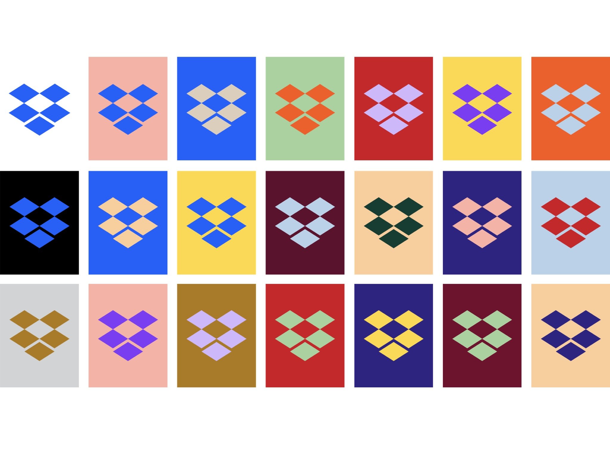
Dropbox steps outside the box with colorful rebrand
Dropbox is embracing a colorful future as it looks to rebrand as a platform that fosters creativity.

All the latest news, reviews, and guides for Windows and Xbox diehards.
You are now subscribed
Your newsletter sign-up was successful
Dropbox has announced a somewhat drastic redesign (via The Verge) today that will see the company supplanting its typical white-and-blue scheme for a bit more color in its logo and advertising. As part of the redesign, Dropbox has embraced a new, flatter logo that, while it still looks like the company's signature box, is a bit more abstract. That's in addition to a new typeface, called Sharp Grotesk, that will accompany branding.
The design refresh is largely a rebranding exercise that Dropbox plans to use to convey itself as a platform for creativity. The focus on creatives is overwhelmingly evident in Dropbox's explanation of the refresh, in which the company proclaims it wants to "unleash the world's creative energy."
All of that said, Dropbox still remains relatively conservative once you sign in, sticking to its blue-and-white color scheme and blue logo when viewing your files. The new design elements will be much more prominent in advertising as it attempts to reel in new users. In an interview with AdWeek, Dropbox CMO Carolyn Feinstein hinted at how we'll likely see the new, more colorful Dropbox used:
Article continues belowWhat this allows us to do is in different environments express ourselves in a way that makes sense for that situation. Sometimes, especially in products when we want to back up a little bit and put the showcase on the work and people using our products, we will stay really blue and white. In other cases, our palette is much richer and able to flex into different environments in the places we might show up while also giving a nod to the creativity of our users.
All the latest news, reviews, and guides for Windows and Xbox diehards.

Dan Thorp-Lancaster is the former Editor-in-Chief of Windows Central. He began working with Windows Central, Android Central, and iMore as a news writer in 2014 and is obsessed with tech of all sorts. You can follow Dan on Twitter @DthorpL and Instagram @heyitsdtl.
